Surprising observations from usability tests
My slides from #a11yTO conf in Toronto
Reading time: 8–14 minutes
Testing with real users can take us beyond treating accessibility as a checkbox-style compliance exercise, allowing us to focus on the usability of our services for our disabled users.
I recently added usability testing to my own toolkit for accessibility work. In a short time I've moderated some tests and observed others, learning a lot about accessibility and usability along the way.
Introductions
I started with a couple of disclaimers; I'm not a usability testing expert or a user researcher - I'm an accessibility person who started usability testing less than two years ago. I'm presenting the things I learned, and that surprised me, as a beginner in this field. I'll also be presenting some findings in English which were originally observed in Finnish, so it's possible that something is lost in translation.
Why usability test?
The audience somewhere like a11yTO conf don't need persuading to care about disabled users, so here I focused on the objections your boss or client might have when you propose starting a usability testing program with disabled users.

Here I made the point that we should still be using the web content accessibility guidelines (WCAG) to assess the minimal accessibility requirements - usability testing does not replace that. Usability testing, as the name suggests, is about assessing the usability, which WCAG doesn't tell us anything about. It's possible to be very accessible (according to WCAG) with poor usability, or vice versa.
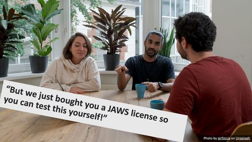
There are two possibilities here, neither is very good:
- You're non-disabled. The suggestion here is that you should cosplay being disabled, rather than talk to real disabled people and learn what works for them.
- You are disabled. Whoever made the suggestion thinks of disability as a monolith, where your experiences (despite working on the software project yourself) will be identical to those of another person with the same disability.
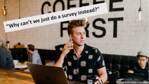
It seems like we've convinced this one that it's necessary to listen to our disabled users. Yay! Surveys are a good method of user research in some contexts. That said, they shouldn't replace usability testing.
Usability tests are about observing users as they try to do things for themselves. We can watch their body language, how accurately they do things, how long things take. In almost every test you will find something that can be improved. If we just ask users what they thought, they will often say everything was good. Surveys can't replace usability tests.
How to usability test
My focus here was on how usability testing with disabled users diverges from general guidance about usability testing - I tried to cover all of the key parts of the process, but focused more on where things might need extra attention.
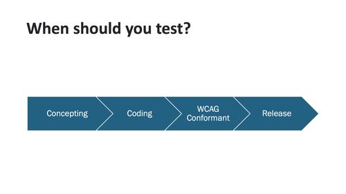
Even in agile software development processes, every new product or feature is going through these stages somewhere. WCAG tells us what the basic barriers we might create are, and what we need to do to avoid them. There's no point running usability tests where you watch disabled participants get stuck by barriers we already know exists, so, in most cases, the sweet spot will be usability testing after we are confident we're conforming to WCAG, but before general release - we want to fix usability issues before most users have been exposed to the service.
If you can make accessible prototypes, usability tests at the concepting stage might be useful, too. Often this is difficult, so it might make sense to use a different research method here.
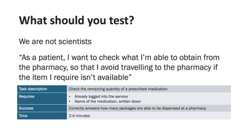
When scientists run experiments like this, they're looking for a statistically significant difference between two groups of participants. Usually, when those of us in industry do something like this, we aren't looking for this. We want to see if the solution meets the needs it was designed to meet, for all of our users.
For this, I suggest starting with the user stories - not disability specific user stories, the general ones that should apply to all or most of your users. For example:
As a patient, I want to check what I’m able to obtain from the pharmacy, so that I avoid travelling to the pharmacy if the item I require isn’t available
From this, we can create a task, where the test participant is the user in the story.
- Description: Check the remaining quantity of a prescribed medication
- Requires: Logged into the service, the name of the medication in writing
- Success: Correctly answers how many packages are able to be dispensed at a pharmacy
Sometimes you might need a long task, but in most cases, a series of 8-10 small tasks works well. This way you can abandon, retry and adjust them easily when you discover a new big barrier, without anyone feeling like a lot of work has been wasted.
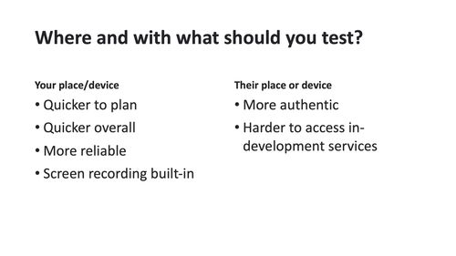
The same considerations apply to where you do tests as apply to whether the participant uses their own device or one you provide them. It's easy to have them visit your office and re-purpose a conference room and it's easy to give them your computer with the test software already running.
You'll see more accurately how the participants approach the tasks if they are in their office or home, surrounded by the materials and people they rely on, using the device they know configured in the way they like it. This especially applies for those using assistive technology. You'll need to balance time and complexity to figure out what you can actually do.
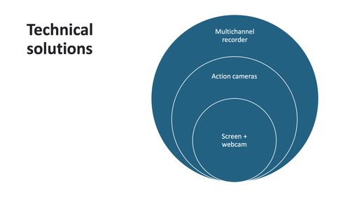
Some books suggest that there should be a notetaker who just sits watching the tests, making detailed notes. I don't like this. I prefer to work from a recording, and avoid lots of pairs of eyes (or a big one-way mirror) starting at the participant the whole time.
The quickest and easiest way to do this, especially if they participant is on your computer, is to record the webcam, microphone and screen. You do, however, lose some perspective and some body language this way. A couple of small, GoPro-style cameras can work too. They can be dotted around the room discreetly, can capture more body language, don't risk slowing the computer down, and work even if the participant brought their own computer.
For the most extreme option, if you have a practically unlimited budget, take a look at broadcast-quality video recorders. These can take several HDMI inputs (some cameras, microphones, the computer, tablet or phone), record them directly to memory cards or hard disks, and the timecodes of the videos match exactly. This is definitely out of reach of most project budgets, but if you're kitting out a testing lab with a good budget, this might be worth considering.
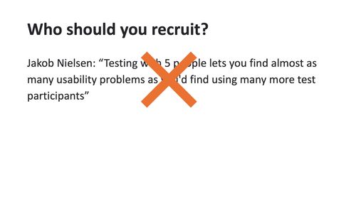
Nielsen said:
Testing with 5 people lets you find almost as many usability problems as you'd find using many more test participants
This opinion has stuck around for a long time. My experiences would suggest that, especially with disabled users, this doesn't hold. Disability is complex. Intersectionality is complex.
It's true that the law of diminishing returns will apply here. Adding participants will, after a point, add less and less value. But your software probably isn't "finished" either - as your software changes, the old findings are invalidated.
I'd recommend doing a pair of tests, deciding what to take from them and whether you want to tweak the testing protocol, then do two more. Given the time you'll need to get everything in place, the software will have changed in this time, too. Don't set yourself a limit, then stop testing. Make testing small things regularly a long-term habit and part of your culture.
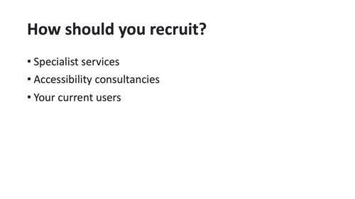
Recruiting disabled users can be hard. If you're in North America, you might be able to use a company like Fable or AccessWorks (from Knowbility). I've heard good things about both, but not been able to use either, since I work in another part of the world.
I've seen mostly quite poor results when people attempt to source test participants from accessibility consultancy companies. If they don't specialize in recruiting usability test participants, the people they have readily available are professional testers, who try new software in a different way to other users (unless you make software aimed at professional testers, of course).
The good results I've seen come from building a good relationship with disabled peoples' organizations, but note that these organizations often own accessibility consultancies, so you may fall into the trap I just mentioned here, too.
The best results I've seen come from the current user pool. For example, whenever someone gives feedback or asks a question about disability. Word-of-mouth works great, too. When you bring in one user, let them take part in an interesting test and compensate them well (more on that below), they'll often be happy to refer you to someone else like them if you ask.
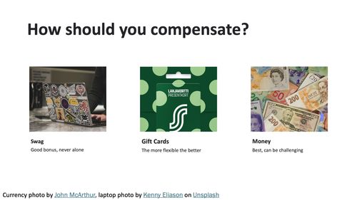
Participants are doing work that depends on their specialist skills and experience, and they deserve to be paid appropriately for that. Some guides to usability testing, which don't focus on disabled participants, might suggest that the chance to visit your company and "peek behind the curtain" at whatever you're working on is enough of a reward. Don't try and pull this with your disabled test participants. Pay them for their time at a similar rate to what you would pay a consultant with specialist skills.
If you can pay with real money, that's best. It might be challenging administratively, but this should always be the first choice. If this isn't feasible, a gift card might be an OK alternative, especially if it is one that can be used in a very wide variety of places. Don't fall into the trap of trying to guess what people will want - "seeking screen reader users for a study, will pay in audiobook gift cards" never sat very well with me.
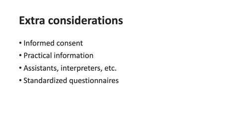
Now, to cover a few small things I've learned from running tests like these;
- Getting informed consent isn't easy. If you're in a big organization, you'll probably get a big contract-style consent form from your legal department. If possible consider creating a plain language version or a summary. Remind participants that they're free to take a break or leave whenever they wish, and if you're handing over money or a gift card, do this at the start, so they don't feel bound to complete the test to get paid.
- If you're working in your own space, have lots of physical accessibility information front-and-center. Is there an elevator? How wide are the doorframes? Is there an accessible restroom available? Once, I was asked whether the elevator had a mirror. This information being volunteered sets the tone for "we know you might have access needs, and we want to meet them".
- If participants are used to working with an assistant or interpreter, they should be involved in the tests too, exactly how they would be if the participant was using your service outside of a test. Be prepared to pay for their time, too.
- Standardized questionnaires like the system usability scale (SUS) are meant to provide comparable, numerical information about how usable participants find your system. This can be useful to compare results, or track progress over time. In my particular work, I've found them to be of limited use, so I'd suggest not placing too much weight on the numerical results, compared to the factors you can observe.
What can you learn?
As I approached the end of my time, I wanted to focus briefly on things you can learn. These are examples of things I've observed from moderating or observing tests, but, as I highlighted earlier, my experiences might not match yours. Rather than incorporating my findings into the next thing you design or develop, treat these as inspiration for your own tests - what do you want to discover about your own projects and users?
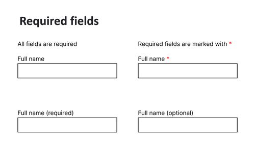
Between several tests, I've seen at least four different approaches to indicating which fields are required. In every case, at least one participant accidentally misses at least one field. I've made peace with this. In the world of distractions, constant rushing and unending deadlines, maybe it's unfair to expect any design alone to prevent accidental field skipping. Let' show them clearly and consistently, but let's make sure our validation is solid, too.
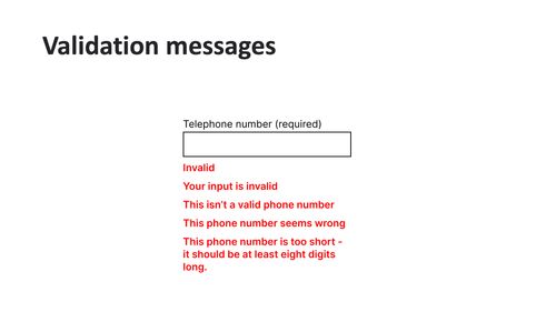
Speaking of validation, one pattern I have seen is that more explicit error messages make users much quicker fixing issues. Some participants see a vague error message and initially object, suggesting this is actually a bug. When the error message explains not just that the value is wrong but why the software knows it's wrong, they tend to figure it out right away.
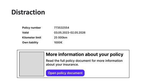
My final example concerns user elements which distract users, especially because their purpose is unclear. Users testing this interface were asked to find the end date of their policy. Most seemed to scan the labels of the key-value pairs, then a lot opened the policy document. The policy document was a long, 30+ page PDF, and none of the content was about this specific policy, just heavy legal copy. Some scrolled through the whole PDF.
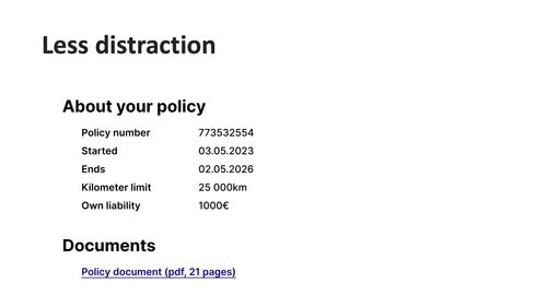
The "improved" version of the page, at least from the users who tested it, includes no key-value pair items which are actually two values, and a much better description of where the policy document link will take you. Participants were now much less likely to get stuck scrolling through a big PDF.
In conclusion
- Let’s aim to build usable, enjoyable experiences, not just accessible ones.
- You can learn how to meet certain WCAG guidelines - sometimes there are multiple conformant approaches, try to discover from your own users whether one suits them better than the others.
- Create your own guidelines based on what works for your users - don't be afraid to exceed WCAG.